Brand Story
01
Verbal
02
Logo
03
Color
04
Typography
05
Introduction
This guide is your reference point for building with clarity, consistency, and care. It defines the visual language of Palladium, from colors and typography to accessibility standards and tone.
At its core, Palladium is about creating space: space that feels intuitive, considered, and trustworthy. These design principles are not just stylistic choices. They reflect our mission to make healthcare simpler, more accessible, and grounded in empathy.
Whether you’re designing a new feature or refining an old one, this guide ensures every detail aligns with our shared values: clarity, ease of use, and a deep respect for the people we serve.
Contents
05
Iconography
6a
Navigation
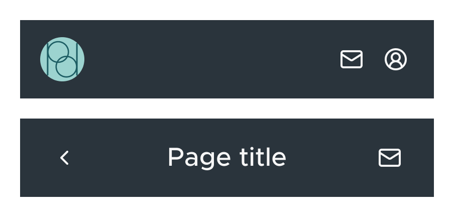
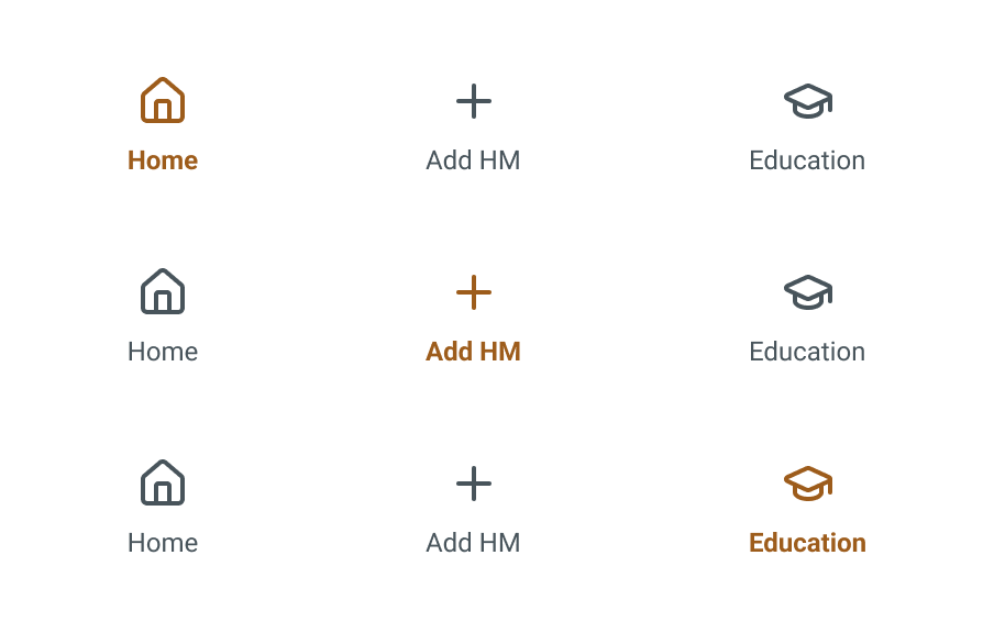
Palladium’s navigation provides a consistent, intuitive structure. Top and bottom bars ensure quick access to key areas like messages, health metrics, and education. Icons are paired with labels and highlight active states using Copper for clear guidance.
6b
Form Input
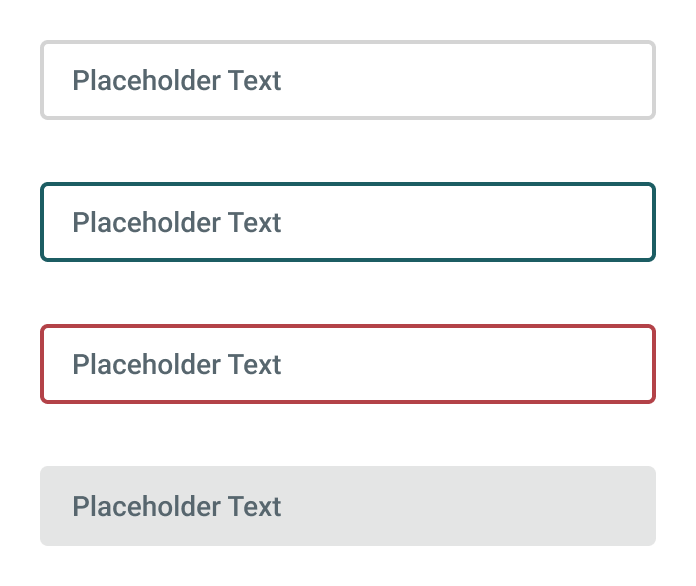
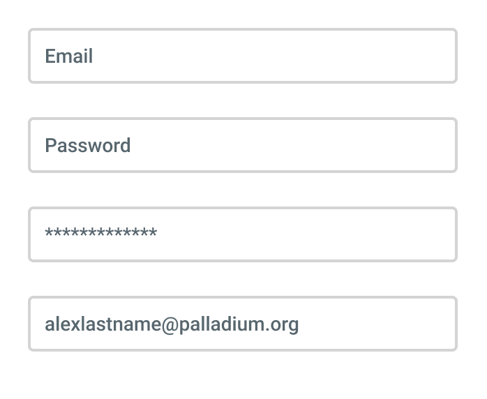
Form inputs are clean, accessible, and easy to scan. Visual states like default, focused, error, and disabled provide clear feedback. Padding, border radius, and label placement support readability and reduce friction.
6c
Selection Controls


Selection components support fast, intentional choices. Radio buttons handle single selections, checkboxes support multiple, and bookmark icons save items. Clear states make interactions easy across screens.
6d
Buttons & Appointment Cards
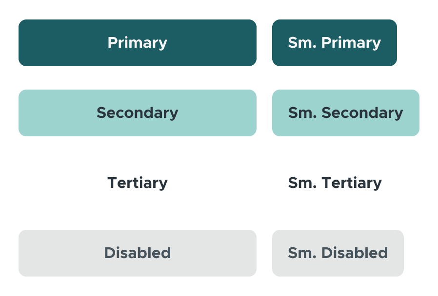
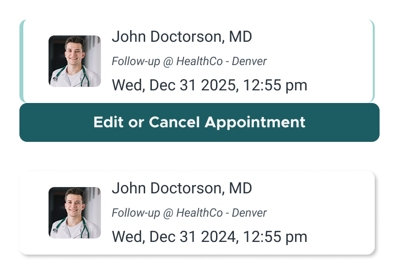
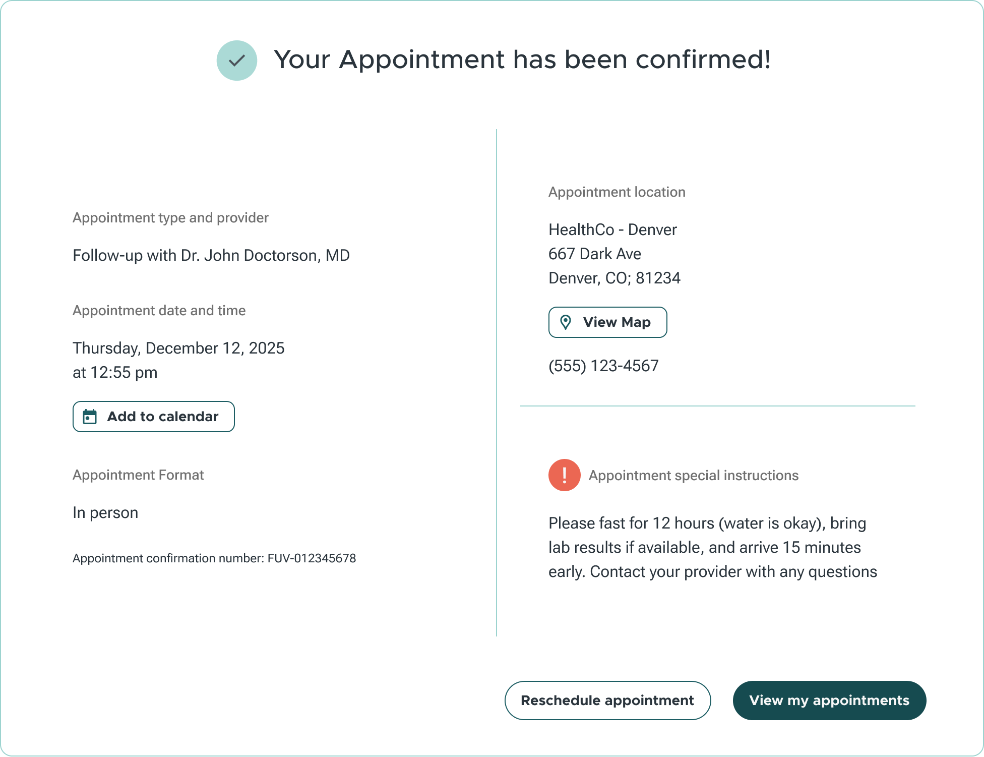
Buttons are structured by priority: primary for key actions, secondary for support, and tertiary for lower emphasis. Disabled and past states are visually distinct. Appointment cards build on this system to support planning and review.
6e
Modals & Resource Cards
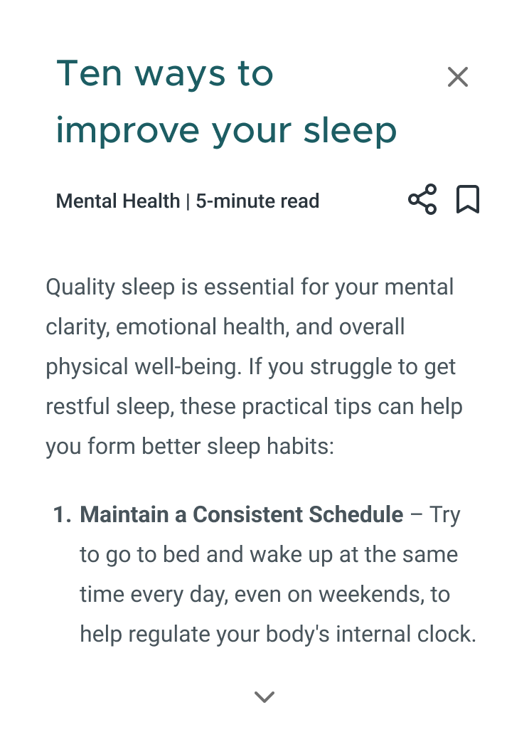
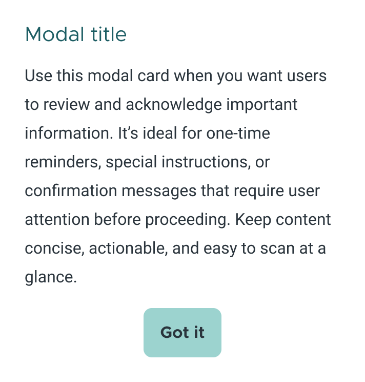
Modals and resource cards present information at the right moment. Modals handle alerts and confirmations. Resource cards deliver educational content in a simple, glanceable format. Both prioritize clarity and ease of use.
6f
Icons Set
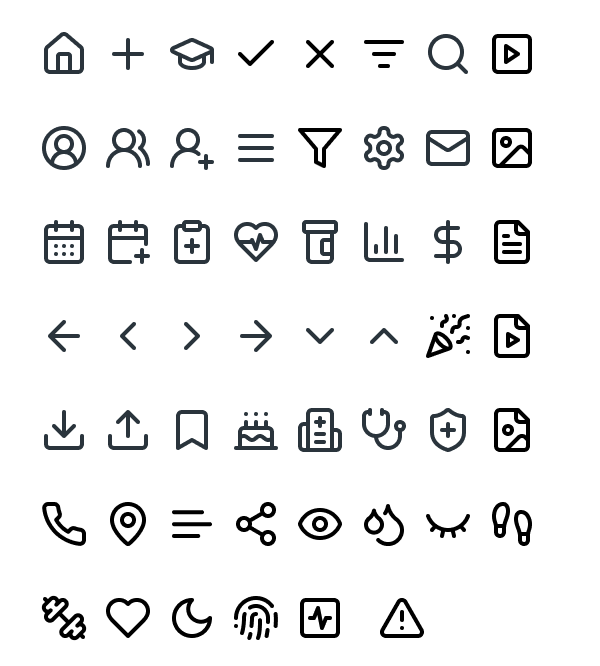
Lucide icons reinforce clarity and cohesion. Their consistent shape and stroke weight support quick recognition while keeping the interface clean and focused.

Introduction
This guide is your reference point for building with clarity, consistency, and care. It defines the visual language of Palladium, from colors and typography to accessibility standards and tone.
At its core, Palladium is about creating space: space that feels intuitive, considered, and trustworthy. These design principles are not just stylistic choices. They reflect our mission to make healthcare simpler, more accessible, and grounded in empathy.
Whether you’re designing a new feature or refining an old one, this guide ensures every detail aligns with our shared values: clarity, ease of use, and a deep respect for the people we serve.
Contents
01
Overview
02
Personality
03
Logo
04
Color
05
Typography
06
Components
07
Accessibility
01
GuideOverview
This document outlines the visual and functional standards for the Palladium product. It was created to ensure consistency across teams, platforms, and use cases, while supporting a design system that is clear, accessible, and adaptable.
The guide includes specifications for typography, color, iconography, components, and accessibility. Each section balances structure with flexibility, allowing contributors to make informed design decisions without reinventing the foundation.
It is intended as a reference for designers, developers, and stakeholders invested in delivering a cohesive user experience.
02
Logo
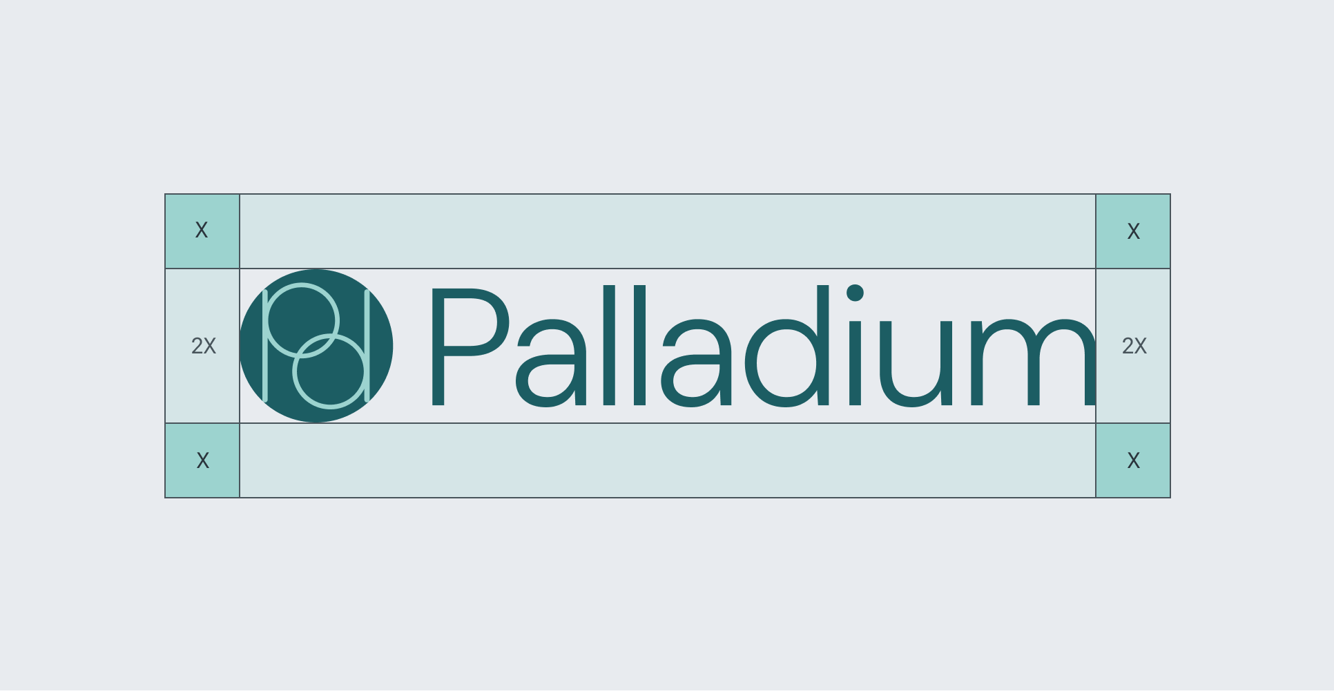
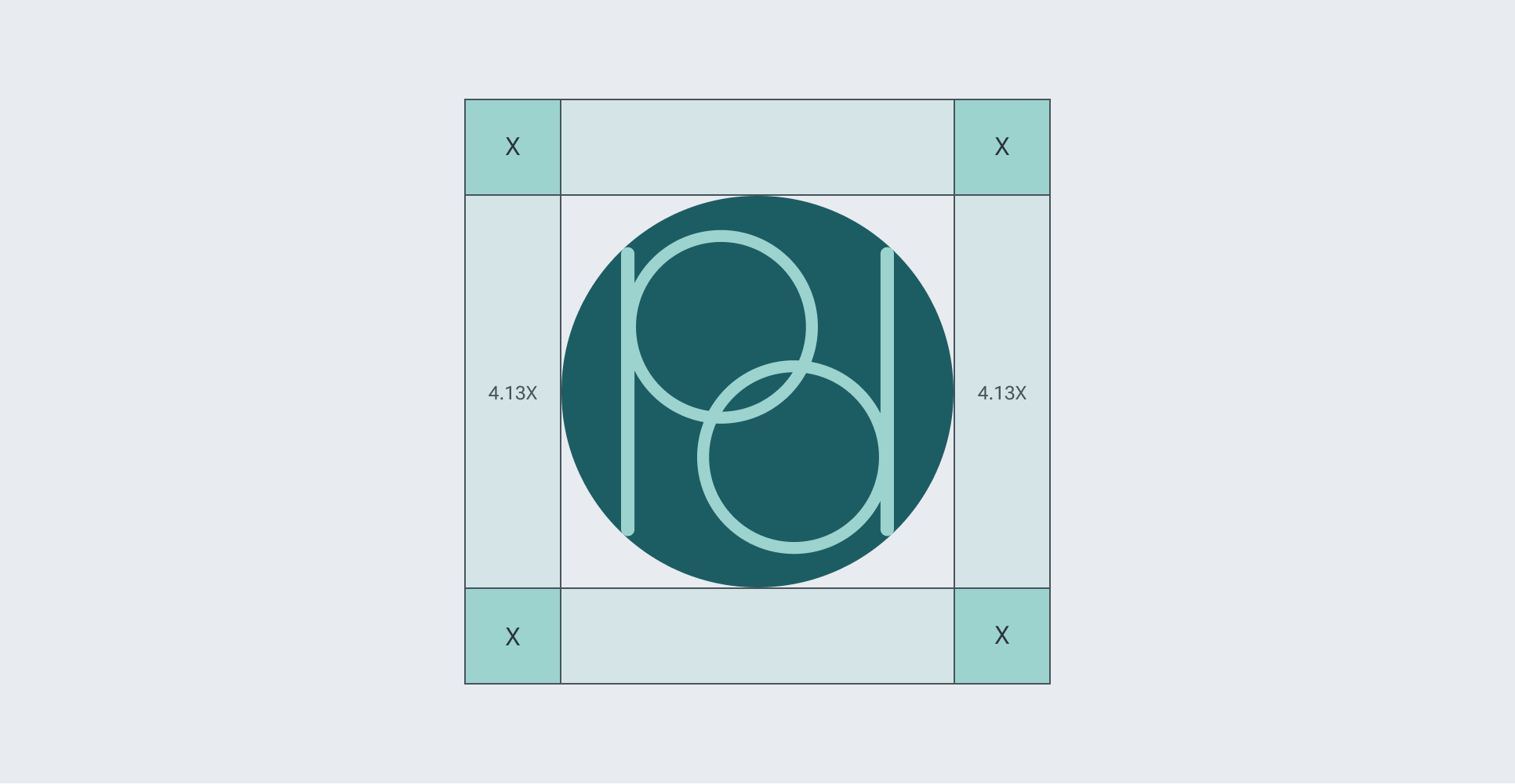
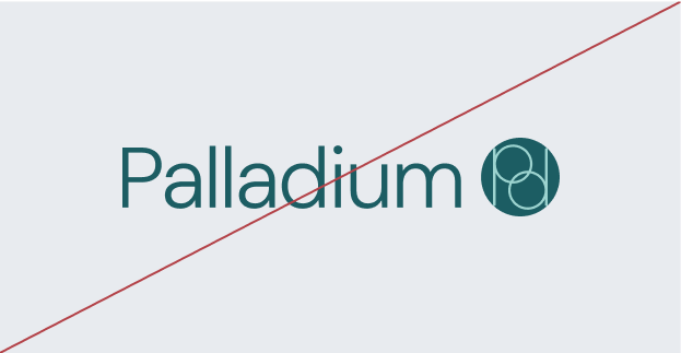
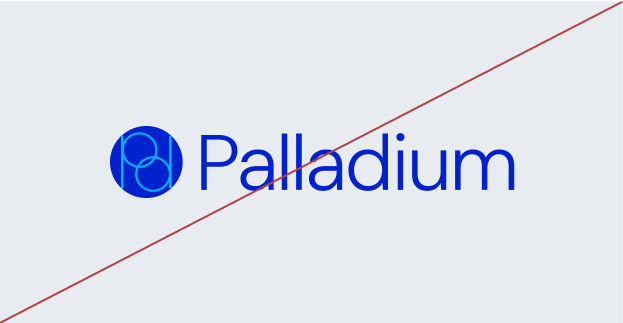
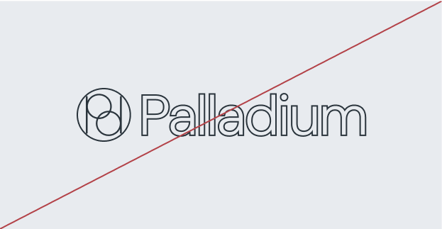
The Palladium logo is the cornerstone of our visual identity. Designed with balance, precision, and warmth, it reflects our commitment to accessible, trustworthy healthcare. The circular mark references interlocking systems and continuity of care, while the modern wordmark anchors the brand with clarity and strength.
Together, the logo elements represent Palladium’s mission: creating healthcare experiences that feel connected, empowering, and human.
03
Color
Palladium’s color palette is designed for clarity, calm, and trust. Each color supports a product experience that feels intuitive and emotionally grounded, helping users navigate with ease and confidence.
Together, these tones create a cohesive visual system that prioritizes accessibility, balance, and thoughtful communication.
04
Typography
Typography shapes how users experience Palladium. From headlines to labels, our type system prioritizes clarity, trust, and ease of use.
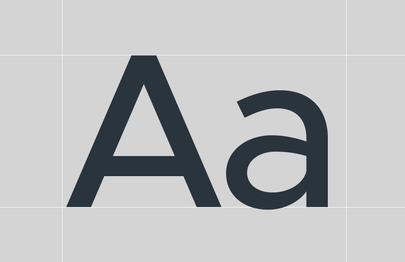
We use Metropolis for headers and key actions. Its clean geometry creates strong hierarchy without feeling rigid. For body text and UI content, we use Roboto Flex, a highly readable system font built for digital interfaces. Together, these typefaces balance personality with performance across screen sizes.
Each style is chosen with purpose. Large headings guide structure, section titles provide direction, and body text stays legible at any size. Labels and captions clearly define inputs and metadata.
These choices support a system that feels thoughtful and organized: one that helps users stay informed and confident.
05
Iconography
Palladium uses the Lucide icon set, an open-source library known for its clean, consistent, and modern design. These icons support transparency, accuracy, and intuitive communication.
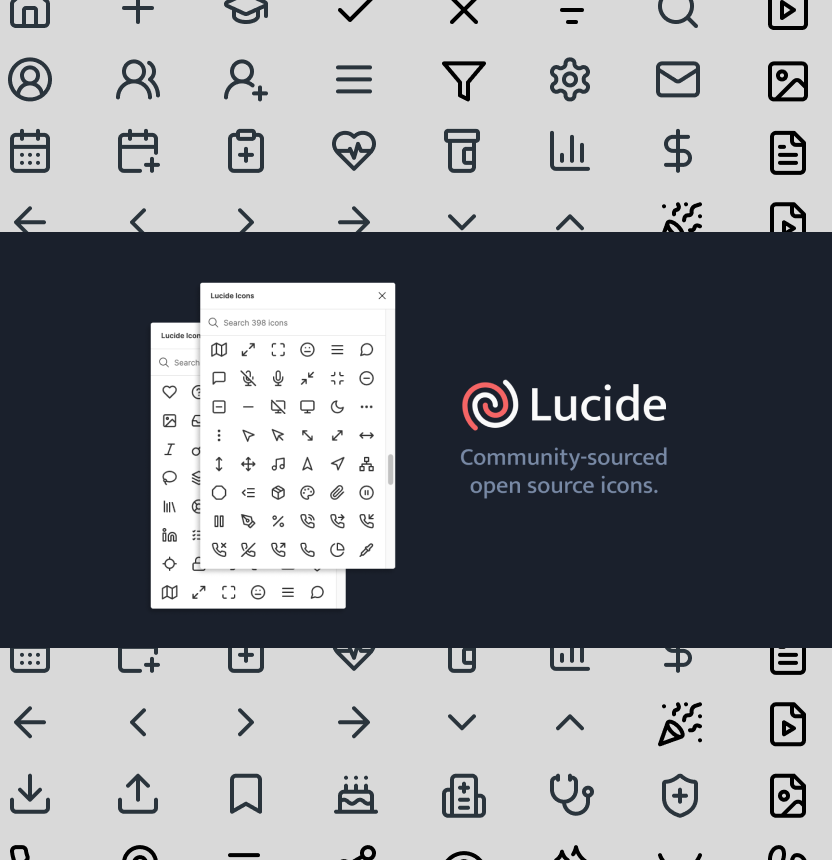
Icons are used sparingly and with intention. Their consistent stroke weight and minimal style align with Palladium’s values of precision, fluidity, and trust. Each icon is selected for clarity and quick recognition. Good iconography doesn't compete for attention. By keeping our visual language simple and purposeful, we help users navigate healthcare with greater ease and confidence.
06
Components
Palladium’s component system is designed for clarity, efficiency, and ease of use. Each element is built to guide users through healthcare tasks with minimal friction, while maintaining consistency across the product. These components follow accessibility best practices, leverage semantic tokens, and are structured for flexible reuse.
6a
Navigation


Palladium’s navigation provides a consistent, intuitive structure. Top and bottom bars ensure quick access to key areas like messages, health metrics, and education. Icons are paired with labels and highlight active states using Copper for clear guidance.
6b
Form Input


Form inputs are clean, accessible, and easy to scan. Visual states like default, focused, error, and disabled provide clear feedback. Padding, border radius, and label placement support readability and reduce friction.
6c
Selection Controls


Selection components support fast, intentional choices. Radio buttons handle single selections, checkboxes support multiple, and bookmark icons save items. Clear states make interactions easy across screens.
6d
Buttons & Appointment Cards


Buttons are structured by priority: primary for key actions, secondary for support, and tertiary for lower emphasis. Disabled and past states are visually distinct. Appointment cards build on this system to support planning and review.
6e
Modals & Resource Cards


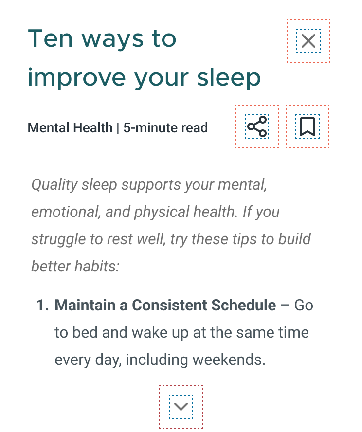
Modals and resource cards present information at the right moment. Modals handle alerts and confirmations. Resource cards deliver educational content in a simple, glanceable format. Both prioritize clarity and ease of use.
6f
Icons Set

Lucide icons reinforce clarity and cohesion. Their consistent shape and stroke weight support quick recognition while keeping the interface clean and focused.
07
Accessibility
Palladium is designed so all users, regardless of ability, can interact with confidence. We follow WCAG 2.1 guidelines and prioritize clear hierarchy, legible typography, strong contrast, and intuitive navigation. Components are tested for keyboard access, screen reader support, and responsive performance across devices.
© 2025 Palladium
•
Conceptual Project
Designed by EMI

Introduction
This guide is your reference point for building with clarity, consistency, and care. It defines the visual language of Palladium, from colors and typography to accessibility standards and tone.
At its core, Palladium is about creating space: space that feels intuitive, considered, and trustworthy. These design principles are not just stylistic choices. They reflect our mission to make healthcare simpler, more accessible, and grounded in empathy.
Whether you’re designing a new feature or refining an old one, this guide ensures every detail aligns with our shared values: clarity, ease of use, and a deep respect for the people we serve.
Contents
01
Overview
02
Logo
03
Color
04
Typography
05
Iconography
06
Components
07
Accessibility
01
GuideOverview
This document outlines the visual and functional standards for the Palladium product. It was created to ensure consistency across teams, platforms, and use cases, while supporting a design system that is clear, accessible, and adaptable.
The guide includes specifications for typography, color, iconography, components, and accessibility. Each section balances structure with flexibility, allowing contributors to make informed design decisions without reinventing the foundation.
It is intended as a reference for designers, developers, and stakeholders invested in delivering a cohesive user experience.
02
Logo
The Palladium logo is the cornerstone of our visual identity. Designed with balance, precision, and warmth, it reflects our commitment to accessible, trustworthy healthcare. The circular mark references interlocking systems and continuity of care, while the modern wordmark anchors the brand with clarity and strength.
Together, the logo elements represent Palladium’s mission: creating healthcare experiences that feel connected, empowering, and human.
03
Color
Palladium’s color palette is designed for clarity, calm, and trust. Each color supports a product experience that feels intuitive and emotionally grounded, helping users navigate with ease and confidence.
Together, these tones create a cohesive visual system that prioritizes accessibility, balance, and thoughtful communication.
04
Typography
Typography shapes how users experience Palladium. From headlines to labels, our type system prioritizes clarity, trust, and ease of use.

We use Metropolis for headers and key actions. Its clean geometry creates strong hierarchy without feeling rigid. For body text and UI content, we use Roboto Flex, a highly readable system font built for digital interfaces. Together, these typefaces balance personality with performance across screen sizes.
Each style is chosen with purpose. Large headings guide structure, section titles provide direction, and body text stays legible at any size. Labels and captions clearly define inputs and metadata.
These choices support a system that feels thoughtful and organized: one that helps users stay informed and confident.
05
Iconography
06
Components
Palladium’s component system is designed for clarity, efficiency, and ease of use. Each element is built to guide users through healthcare tasks with minimal friction, while maintaining consistency across the product. These components follow accessibility best practices, leverage semantic tokens, and are structured for flexible reuse.
6a
Navigation


Palladium’s navigation provides a consistent, intuitive structure. Top and bottom bars ensure quick access to key areas like messages, health metrics, and education. Icons are paired with labels and highlight active states using Copper for clear guidance.
6c
Selection Controls


Selection components support fast, intentional choices. Radio buttons handle single selections, checkboxes support multiple, and bookmark icons save items. Clear states make interactions easy across screens.
6d
Buttons & Appointment Cards


Buttons are structured by priority: primary for key actions, secondary for support, and tertiary for lower emphasis. Disabled and past states are visually distinct. Appointment cards build on this system to support planning and review.
6e
Modals & Resource Cards


Modals and resource cards present information at the right moment. Modals handle alerts and confirmations. Resource cards deliver educational content in a simple, glanceable format. Both prioritize clarity and ease of use.
6f
Icons Set

Lucide icons reinforce clarity and cohesion. Their consistent shape and stroke weight support quick recognition while keeping the interface clean and focused.
07
Accessibility
Palladium is designed so all users, regardless of ability, can interact with confidence. We follow WCAG 2.1 guidelines and prioritize clear hierarchy, legible typography, strong contrast, and intuitive navigation. Components are tested for keyboard access, screen reader support, and responsive performance across devices.
© 2025 Palladium
Conceptual Project
Designed by EMI
